PD Renovations

PD Home Renovations came to us needing a website to showcase their services. We worked hard to exceed their expectations and create a visually stunning site that represents their brand. Our collaboration with the client throughout development ensured a smooth process. Our skilled team crafted a professional and unique site that sets PD Home Renovations apart from the competition.

Learn More

Alpha Property Improvement

Alpha Property Improvement initially launched their online presence with a DIY Wix site created by the owner. Over time, they realized that their website was not attracting enough clients. That's when they turned to our expert team. We designed a top-notch website with advanced SEO capabilities. Since the upgrade, they've been attracting more clients than ever before, significantly boosting their business.

Learn More

PD Renovations

PD Home Renovations came to us needing a website to showcase their services. We worked hard to exceed their expectations and create a visually stunning site that represents their brand. Our collaboration with the client throughout development ensured a smooth process. Our skilled team crafted a professional and unique site that sets PD Home Renovations apart from the competition.

Learn More

Alpha Property Improvement

Alpha Property Improvement initially launched their online presence with a DIY Wix site created by the owner. Over time, they realized that their website was not attracting enough clients. That's when they turned to our expert team. We designed a top-notch website with advanced SEO capabilities. Since the upgrade, they've been attracting more clients than ever before, significantly boosting their business.

Learn More
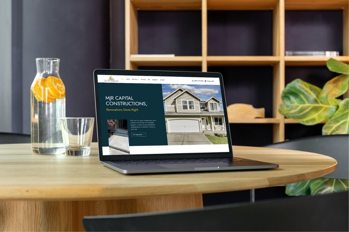
Website Design & Development

MJR Capital Constructions needed a website that matched the quality of their large-scale renovations and builds. We designed a professional, structured website that clearly showcases their services, certifications, and commitment to quality. The site was built to support credibility, generate leads, and speak to both residential and commercial clients.

Client Background & Their Needs

Client Type: Full-service renovations and new construction company in the GTA
Purpose: Needed a high-end site that builds trust, highlights their services, and converts web visitors into real client leads.

The Pain Points

  • “We do big jobs — our site needs to reflect that level of professionalism.”
  • “It should be easy for people to see what we offer and request a quote.”
  • “We want to look trustworthy and credible from the first click.”

The Plan

  • Premium Design: Dark-blue and gold theme with professional layout to reflect upscale work.
  • Service Clarity: Added structured service blocks with icons and real job photos.
  • Trust Signals: Showcased 2-year warranty, $1M insurance, and legal certifications.
  • Lead Funnels: Multiple CTA areas, including mid-page forms and scroll-stopping quote sections.

The Result

Metric Before Website After Website
Brand image Basic and unclear High-end, professional, and structured
Lead generation Low submission rate Improved CTA placement and form fills
Trust and authority Limited credentials shown Warranty, insurance, and licenses clearly displayed
Project showcasing Minimal visuals Real job photos and service-specific galleries
User experience Cluttered layout Smooth flow, scannable content, mobile-optimized

Website Design & Development

Flourish Landscaping needed a clean, upscale website to reflect their professionalism and target higher-end landscaping clients. We created a modern layout with a soft natural theme, clear service breakdowns, strong social proof, and multiple call-to-actions to drive quote requests.

Client Background & Their Needs

Client Type: Landscaping and hardscaping company in Ontario
Purpose: Needed a polished website that looks premium, builds trust, and helps secure more commercial and high-value residential clients.

The Pain Points

  • “We want our website to reflect the high quality of our work.”
  • “It should show we do more than just landscaping — we handle full outdoor projects.”
  • “We need to get more quote requests from commercial clients and homeowners.”

The Plan

  • Modern Visual Design: Soft greens, curved shapes, and clean layout to feel natural but high-end.
  • Service Cards: Simple and clear service blocks that explain what they offer at a glance.
  • Portfolio Slider: Project spotlights with before/after context to show real work and results.
  • Social Proof: Highlighted Google reviews, WSIB compliance, and $2M insurance to build trust.

The Result

Metric Before Website After Website
Design style Plain and generic Modern, nature-inspired and premium
Lead flow Low quote inquiries Increased quote submissions with better CTA placement
Commercial appeal Looked more residential-only Now includes commercial grounds care and hardscaping
Trust signals Minimal Google reviews, insurance badges, team photo
Project showcasing No before/after proof Live portfolio with context and visuals

Website Design & Development

ARMS LRM needed a website that showed off their full range of landscaping and property services in a clean and simple way. We created a modern, mobile-friendly site with bold visuals, easy navigation, and a quote form designed to drive leads. Every section is built to convert—from services and trust badges to an FAQ and real team photos.

Client Background & Their Needs

Client Type: Landscaping & junk removal company in London, Ontario
Purpose: Wanted a strong online presence that clearly explains their services and helps local homeowners request a free quote fast.

The Pain Points

  • “People didn’t really know all the services we offer.”
  • “We weren’t getting many quote requests from the old site.”
  • “We needed something sharp, clean, and easy to use on phones.”

The Plan

  • Full Redesign: Gave the site a modern, professional look to match the quality of work.
  • Service Pages: Added clear service sections with icons and short blurbs for each offering.
  • Lead Capture: Designed a strong call-to-action with a same-day quote form.
  • Trust Building: Added insurance info, team photo, and over 500+ happy customer mentions.

The Result

Metric Before Website After Website
Design quality Outdated and basic Modern, mobile-optimized
Quote submissions Low and inconsistent Higher and more consistent with clear CTA
Service clarity Hard to understand Each service clearly explained
Mobile experience Not user-friendly Fully responsive on all devices
Trust factors Minimal trust signals Insurance, team intro, customer count

Website Design & Development

SweetHomeSpaces needed a clean, professional website that reflected their high-end renovation services in the GTA. We built them a fully responsive, conversion-optimized site with a strong focus on trust signals, service clarity, and modern design. The website includes service pages, a portfolio section, an FAQ, and a custom contact form to increase lead generation.

Client Background & Their Needs

Client Type: Renovation company based in the Greater Toronto Area
Purpose: Needed a full website redesign that looked professional, showcased their work, and helped them stand out in a competitive market.

The Pain Points

  • “Our old site didn’t look professional — it made us look like a small operation.”
  • “People weren’t finding us on Google or reaching out after visiting the site.”
  • “We needed something that clearly shows what we do, builds trust, and gets us clients.”

The Plan

  • Modern Layout: Clean, mobile-friendly design that looks great on all screen sizes.
  • SEO Optimization: Keyword-focused service pages for better search visibility.
  • Trust Sections: Added testimonials, insurance badges, and an “About the CEO” section to build trust.
  • Conversion Focus: Built a clear call-to-action strategy with forms and buttons placed throughout the site.

The Result

Metric Before Website After Website
Site design Outdated and basic Modern, clean, mobile-friendly
Lead generation Low contact form submissions Higher form fills and inquiries
Trust signals Minimal trust content Client reviews, CEO intro, insurance proof
Navigation Confusing, poor flow Clear service layout and CTA flow
SEO positioning Not ranking for main services Indexed and optimized for local search